2 Solar Panels and Ice Creams
Imagine you are the proud owner of a solar panel, somewhere in Brandenburg, the region around Berlin in Germany.
Tomorrow, your weather forecast application predicts 4 hours of direct sunlight. If that is true, how much electricity would your solar panel produce?
If you asked me now, I would have no way to guess. This is where linear regression can help.
2.1 Representing Data in Two Dimensions
You could start by plotting previous days’ energy production and hours of sunlight on a simple chart:
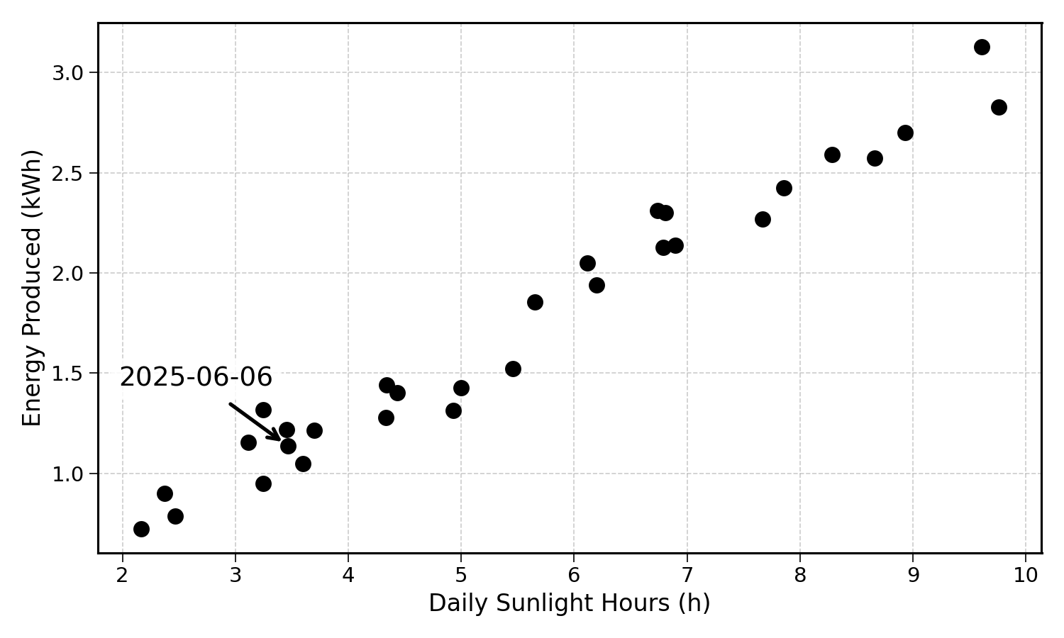
Here, each point represents a day. Its x-axis coordinate represents the hours of sunlight, and its y-axis coordinate the energy produced on that day.
As an example, on the 6th of June 2025 (see annotation), there were around 3.5 hours of direct sunlight, producing an energy of approximately 1.1 kilowatt hours.
Taking a ruler, you could draw a line through the points. This line could be a good prediction for other future dates.
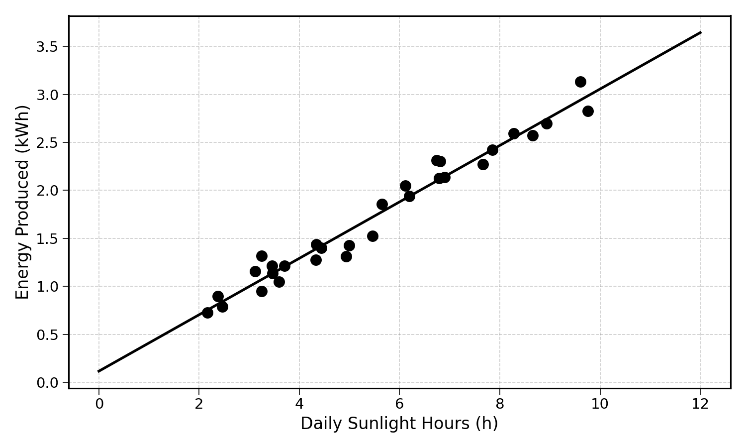
2.2 Generating Predictions
Let’s say the weather forecast announces 2.5 hours of sunlight tomorrow.
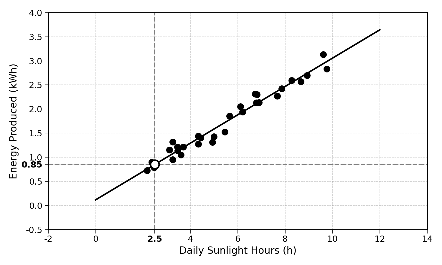
You could then use a ruler and draw a vertical line at 2.5 on the x-axis. The predicted electricity production would be the value on the regression line that crosses this vertical line.
With this (homemade) linear regression, you could theoretically predict the electricity production for any number of hours of sunlight. Not bad.
2.3 Ice Creams
Now, let’s say that in addition to owning a solar panel, you run an ice cream shop in the closest town. The weather forecast announces 25 degrees Celsius (77 Fahrenheit for American readers).
Using this information, you would like to predict the number of ice creams you will sell that day. This would allow you to better plan your staff and inventory.
Between solar panels and ice cream shops, your businesses would start relying a lot on sunny weather. You may want to diversify your sources of income.
To think about this prediction task, you could start by plotting the previous days in a two-dimensional chart, by temperature and sales:
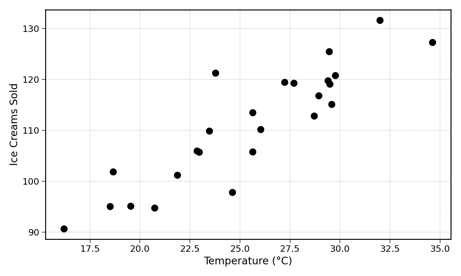
Exercise 2.1 Using the chart above, try drawing a line and coming up with a rough estimate of the number of ice creams sold on a day with a temperature of 25 degrees Celsius.
For ebook readers (or those who do not want to take a ruler out), I have drawn a line on the image below:
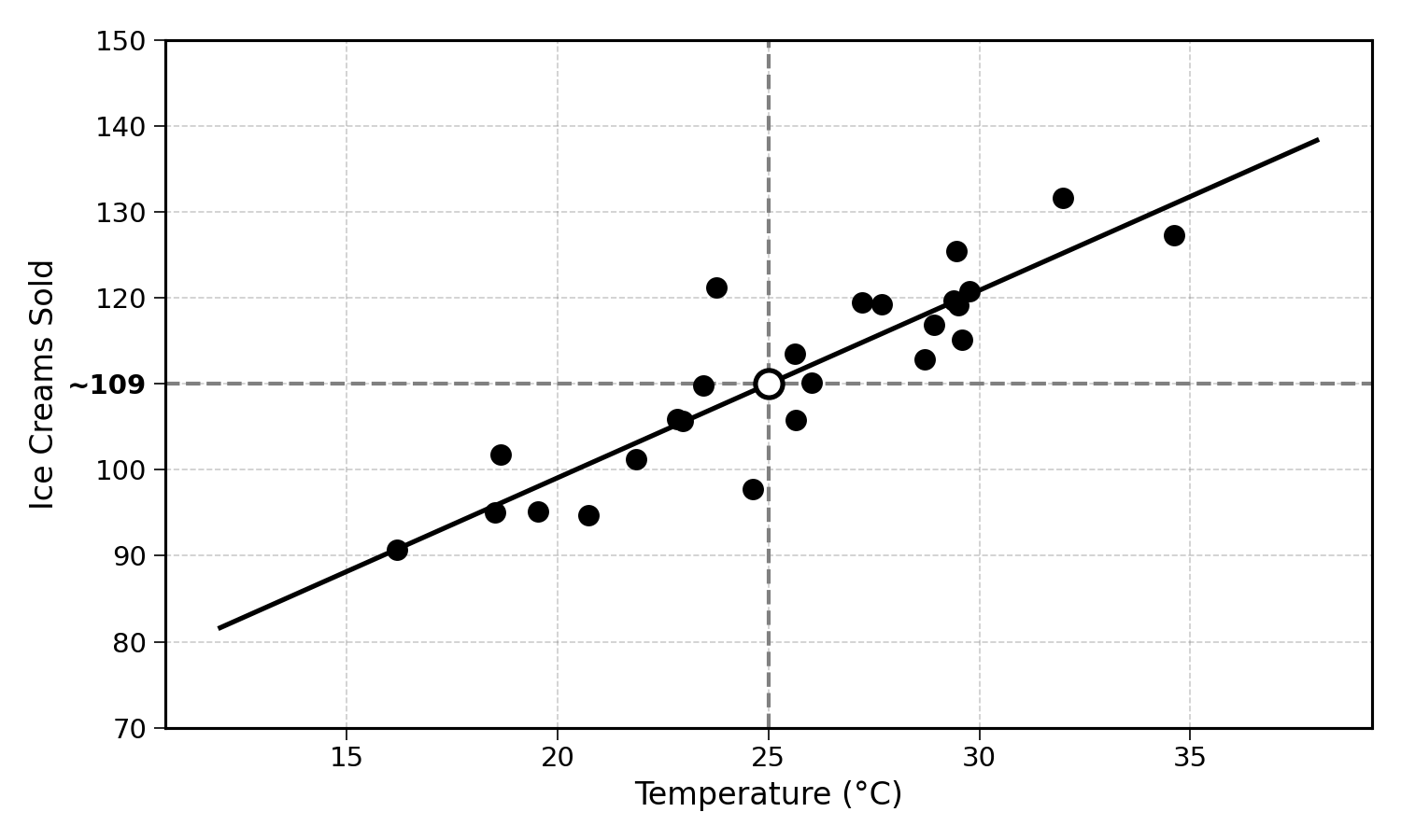
Using this line, you can see that around 110 ice creams sold would be a reasonable prediction for a 25°C day.
I can already picture the inquisitive reader thinking: “Wait a minute, there are so many more factors that influence ice cream sales… Day of the week, season of the year, location of the shop, etc…”. I thought you’d never ask. After understanding linear regression, this book will explore multiple linear regression to take other factors into account.
2.4 Final Thoughts
There are actually a lot of concepts involved with “drawing a line” that best fits past observations. These will be explored over the next few chapters. If you ever feel lost, it helps remembering the simple ice cream sales example.
The next chapter will focus on the first building block of our prediction approach: data.
2.5 Solutions
Solution 2.1. Exercise 2.1
Looking at the scatter plot, a reasonable approach is to:
- Identify the general trend of the data (sales increase with temperature)
- Draw a line that passes through the middle of the points
- Find where x = 25 intersects this line
The exact answer will vary depending on your line, but a prediction between 100-130 ice creams would be reasonable given the data shown.